
***Â This post was originally published in ACRL TechConnect on Oct. 15, 2013. ***
A. Oh, the Library Catalog
Almost all librarians have a love-hate relationship with their library catalogs (OPAC), which are used by library patrons. Interestingly enough, I hear a lot more complaints about the library catalog from librarians than patrons. Sometimes it is about the catalog missing certain information that should be there for patrons. But many other times, it’s about how crowded the search results display looks. We actually all want a clean-looking, easy-to-navigate, and efficient-to-use library catalog. But of course, it is much easier to complain than to come up with an viable alternative.
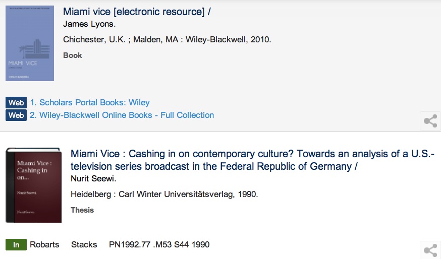
Aaron Schmidt has recently put forth an alternative design for a library item record. In his blog post, he suggests a library catalog shifts its focus from the bibliographic information (or metadata if not a book) of a library item to a patron’s tasks performed in relation to the library item so that the catalog functions more as “a tool that prioritizes helping people accomplish their tasks, whereby bibliographic data exists quietly in the background and is exposed only when useful.” This is a great point. Throwing all the information at once to a user only overwhelms her/him. Schmidt’s sketch provides a good starting point to rethink how to design the library catalog’s search results display.
From the blog post, “Catalog Design” by Aaron Schmidt
B. Thinking about Alternative Display Design
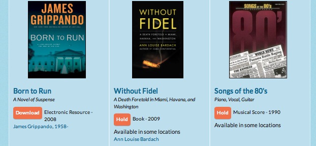
The example above is, of course, too simple to apply to the library catalog of an academic library straight away. For an usual academic library patron to determine whether s/he wants to either check out or reserve the item, s/he is likely to need a little more information than the book title, the author, and the book image. For example, students who look for textbooks, the edition information as well as the year of publication are important. But I take it that Schmidt’s point was to encourage more librarians to think about alternative designs for the library catalog rather than simply compare what is available and pick what seems to be the best among those.

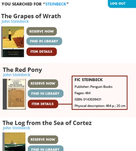
Florida International University Library Catalog – Discovery layer, Mango, provided by Florida Virtual Campus
Granted that there may be limitations in how much we can customize the search results display of a library catalog. But that is not a reason to stop thinking about what the optimal display design would be for the library catalog search results. Sketching alternatives can be in itself a good exercise in evaluating the usability of an information system even if not all of your design can be implemented.
Furthermore, more and more libraries are implementing a discovery layer over their library catalogs, which provides much more room to customize the display of search results than the traditional library catalog. Open source discovery systems such as Blacklight or VuFind provides great flexibility in customizing the search results display. Even proprietary discovery products such as Primo, EDS, Summon offer a level of customization by the libraries.
Below, I will discuss some principles to follow in sketching alternative designs for search results in a library catalog, present some of my own sketches, and show other examples implemented by other libraries or websites.
C. Principles
So, if we want to improve the item record summary display to be more user-friendly, where can we start and what kind of principles should we follow? These are the principles that I followed in coming up with my own design:
- De-clutter.
- Reveal just enough information that is essential to determine the next action.
- Highlight the next action.
- Shorten texts.
These are not new principles. They are widely discussed and followed by many web designers including librarians who participate in their libraries’ website re-design. But we rarely apply these to the library catalog because we think that the catalog is somehow beyond our control. This is not necessarily the case, however. Many libraries implement discovery layers to give a completely different and improved look from that of their ILS-es’ default display.
Creating a satisfactory design on one’s own instead of simply pointing out what doesn’t work or look good in existing designs is surprisingly hard but also a refreshing challenge. It also brings about the positive shift of focus in thinking about a library catalog from “What is the problem in the catalog?” to “What is a problem and what can we change to solve the problem?”
Below I will show my own sketches for an item record summary view for the library catalog search results. These are clearly a combination of many other designs that I found inspiring in other library catalogs. (I will provide the source of those elements later in this post.) I tried to mix and revise them so that the result would follow those four principles above as closely as possible. Check them out and also try creating your own sketches. (I used Photoshop for creating my sketches.)
D. My Own Sketches
Here is the basic book record summary view. What I tried to do here is giving just enough information for the next action but not more than that: title, author, type, year, publisher, number of library copies and holds. The next action for a patron is to check the item out. On the other hand, undecided patrons will click the title to see the detailed item record or have the detailed item record to be texted, printed, e-mailed, or to be used in other ways.
(1) A book item record
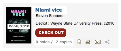
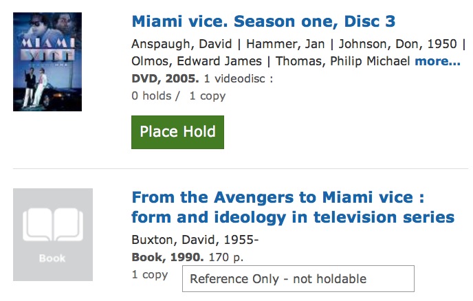
This is a record of a book that has an available copy to check out. Only when a patron decides to check out the item, the next set of information relevant to that action – the item location and the call number – is shown.
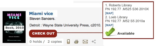
(2) With the check-out button clicked
If no copy is available for check-out, the best way to display the item is to signal that check-out is not possible and to highlight an alternative action. You can either do this by graying out the check-out button or by hiding the button itself.
Many assume that adding more information would automatically increase the usability of a website. While there are cases in which this could be true, often a better option is to reveal information only when it is relevant.
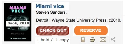
I decided to gray out the check-out button when there is no available copy and display the reserve button, so that patrons can place a hold. Information about how many copies the library has and how many holds are placed (“1 hold / 1 copy”) would help a patron to decide if they want to reserve the book or not.
(3) A book item record when check-out is not available
I also sketched two other records: one for an e-Book without the cover image and the other with the cover image. Since the appropriate action in this case is reading online, a different button is shown. You may place the ‘Requires Login’ text or simply omit it because most patrons will understand that they will have to log in to read a library e-book and also the read-online button will itself prompt log in once clicked anyway.
(4) An e-book item record without a book cover
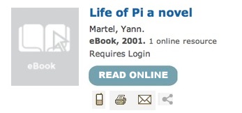
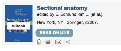
(5) An e-book item record with a book cover
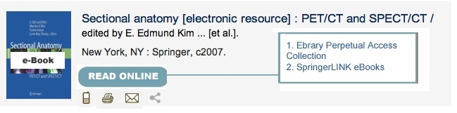
(6) When the ‘Read Online’ button is clicked, an e-book item record with multiple links/providers
When there are multiple options for one electronic resource, those options can be presented in a similar way in which multiple copies of a physical book are shown.
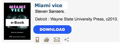
(6) A downloadable e-book item record
For a downloadable resource, changing the name of the button to ‘download’ is much more informative.
(7) An e-journal item record
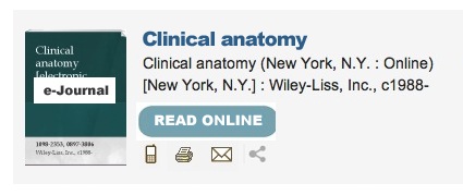
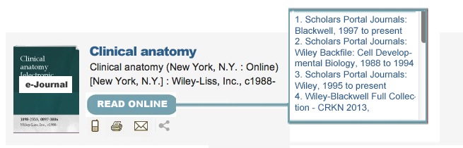
(7) When the ‘Read Online’ button is clicked, an e-journal item record with multiple links/providers
E. Inspirations
Needless to say, I did not come up with my sketches from scratch. Here are the library catalogs whose item record summary view inspired me.
Toronto Public Library catalog has an excellent item record summary view, which I used as a base for my own sketches. It provides just enough information for the summary view. The title is hyperlinked to the detailed item record, and the summary view displays the material type and the year in bod for emphasis. The big green button also clearly shows the next action to take. It also does away with unnecessary labels that are common in library catalog such as ‘Author:’ ‘Published:’ ‘Location:’ ‘Link:.’
User Experience Designer Ryan Feely, who worked on Toronto Public Library’s catalog search interface, pointed out the difference between a link and an action in his 2009 presentation “Toronto Public Library Website User Experience Results and Recommendations.” Actions need to be highlighted as a button or in some similar design to stand out to users (slide 65). And ideally, only the actions available for a given item should be displayed.
Another good point which Feely makes (slide 24) is that an icon is often the center of attention and so a different icon should be used to signify different type of materials such as a DVD or an e-Journal. Below are the icons that Toronto Public Library uses for various types of library materials that do not have unique item images. These are much more informative than the common “No image available” icon.


University of Toronto Libraries has recently redesigned their library catalog to be completely responsive. Their item record summary view in the catalog is brief and clear. Each record in the summary view also uses a red and a green icon that helps patrons to determine the availability of an item quickly. The icons for citing, printing, e-mailing, or texting the item record that often show up in the catalog are hidden in the options icon at the bottom right corner. When the mouse hovers over, a variety of choices appear.
Richland Library’s catalog displays library items in a grid as a default, which makes the catalog more closely resemble an online bookstore or shopping website. Patrons can also change the view to have more details shown with or without the item image. The item record summary view in the default grid view is brief and to the point. The main type of patron action, such as Hold or Download, is clearly differentiated from other links as an orange button.

Standford University Library offers a grid view (although not as the default like Richland Library). The grid view is very succinct with the item title, call number, availability information in the form of a green checkmark, and the item location.
What is interesting about Stanford University Library catalog (using Blacklight) is that when a patron hovers its mouse over an item in the grid view, the item image displays the preview link. And when clicked, a more detailed information is shown as an overlay.
Brigham Young University completely customized the user interface of the Primo product from ExLibris.

And University of Michigan Library customized the search result display of the Summon product from SerialsSolutions.

Here are some other item record summary views that are also fairly straightforward and uncluttered but can be improved further.
Sacramento Public Library uses the open source discovery system, VuFind, with little customization.
I have not done an extensive survey of library catalogs to see which one has the best item record summary view. But it seemed to me that in general academic libraries are more likely to provide more information than necessary in the item record summary view and also to require patrons to click a link instead of displaying relevant information right away. For example, the ‘Check availability’ link that is shown in many library catalogs is better when it is replaced by the actual availability status of ‘available’ or ‘checked out.’ Similarly, the ‘Full-text online’ or ‘Available online’ link may be clearer with an button titled ‘Read online’ or ‘Access online.’
F. Challenges and Strategies
The biggest challenge in designing the item record summary view is to strike the balance between too little information and too much information about the item. Too little information will require patrons to review the detailed item record just to identify if the item is the one they are looking for or not.
Since librarians know many features of the library catalog, they tend to err on the side of throwing all available features into the item record summary view. But too much information not only overwhelms patrons and but also makes it hard for them to locate the most relevant information at that stage and to identify the next available action. Any information irrelevant to a given task is no more than noise to a patron.
This is not a problem unique to a library catalog but generally applicable to any system that displays search results. In their book, Designing the Search Experience , Tony Russell-Rose and Tyler Tate describes this as achieving ‘the optimal level of detail.’ (p.130)
Useful strategies for achieving the optimal level of detail for the item summary view in the case of the library catalog include:
- Removing all unnecessary labels
- Using appropriate visual cues to make the record less text-heavy
- Highlighting next logical action(s) and information relevant to that action
- Systematically guiding a patron to the actions that are relevant to a given item and her/his task in hand
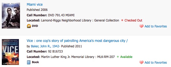
Large online shopping websites, Amazon, Barnes & Noble, and eBay all make a good use of these strategies. There are no labels such as ‘price,’ ‘shipping,’ ‘review,’ etc. Amazon highlights the price and the user reviews most since those are the two most deciding factors for consumers in their browsing stage. Amazon only offers enough information for a shopper to determine if s/he is further interested in purchasing the item. So there is not even the Buy button in the summary view. Once a shopper clicks the item title link and views the detailed item record, then the buying options and the ‘Add to Cart’ button are displayed prominently.
Barnes & Noble’s default display for search results is the grid view, and the item record summary view offers only the most essential information – the item title, material type, price, and the user ratings.
eBay’s item record summary view also offers only the most essential information, the highest bid and the time left, while people are browsing the site deciding whether to check out the item in further detail or not.
G. More Things to Consider
An item record summary view, which we have discussed so far, is surely the main part of the search results page. But it is only a small part of the search results display and even a smaller part of the library catalog. Optimizing the search results page, for example, entails not just re-designing the item record summary view but choosing and designing many other elements of the page such as organizing the filtering options on the left and deciding on the default and optional views. Determining the content and the display of the detailed item record is another big part of creating a user-friendly library catalog. If you are interested in this topic, Tony Russell-Rose and Tyler Tate’s book Designing the Search Experience (2013) provides an excellent overview.
Librarians are professionals trained in many uses of a searchable database, a known item search, exploring and browsing, a search with incomplete details, compiling a set of search results, locating a certain type of items only by location, type, subject, etc. But since our work is also on the operation side of a library, we often make the mistake of regarding the library catalog as one huge inventory system that should hold and display all the acquisition, cataloging, and holdings information data of the library collection. But library patrons are rarely interested in seeing such data. They are interested in identifying relevant library items and using them. All the other information is simply a guide to achieving this ultimate goal, and the library catalog is another tool in their many toolboxes.
Online shopping sites optimize their catalog to make purchase as efficient and simple as possible. Both libraries and online shopping sites share the common interests of guiding the users to one ultimate task – identifying an appropriate item for the final borrowing or access/purchase. For creating user-oriented library catalog sketches, it is helpful to check out how non-library websites are displaying their search results as well.
Once you start looking other examples, you will realize that there are very many ways to display search results and you will soon want to sketch your own alternative design for the search results display in the library catalog and the discovery system. What do you think would be the level of optimum detail for library items in the library catalog or the discovery interface?
Further Reading
- Tony Russell-Rose, “Designing Search Displaying Results,” UX Magazine, 2013.
http://uxmag.com/articles/designing-search-displaying-results - Tony Russell-Rose and Tyler Tate, Designing the Search Experience, Morgan Kaufmann, 2013.