** This blog post has been originally published in ACRL TechConnect 0n May 30, 2012. **
The Big Type
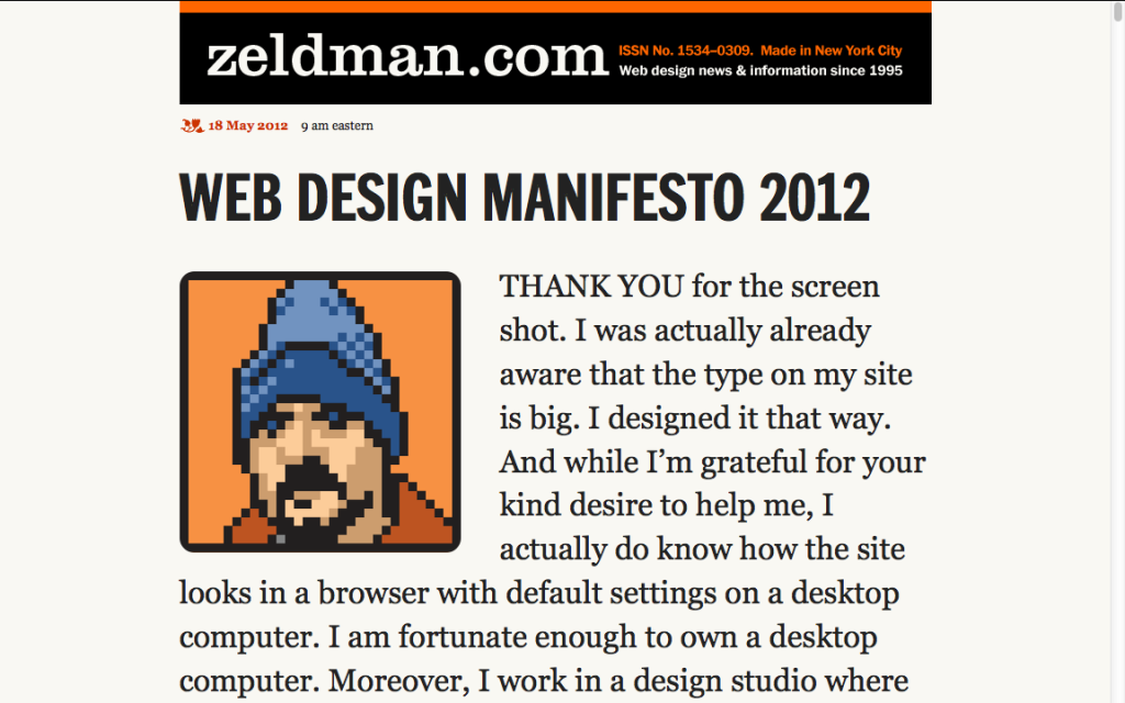
Jeffrey Zeldman published a post that explains his choice of big type in his website/blog last week. If you are curious about how huge the type is in his site, see below my screenshot (or visit his site: http://zeldman.com). It is pretty big. Compare it to any Web site or this current site of mine. Yea, the type is huge.
He says people either hate or love the big type and the simplistic/minimalist layout of his site or just spends time processing them. I found myself loving it because hey, it was so fr**king easy to read without any other distraction in the site. As Zeldman himself says, “It’s over the top but not unusable nor, in my opinion, unbeautiful.” And in my opinion, being fully functional counts to a great degree in favor of beauty. Â
Readability
The strange satisfaction that I felt while reading the articles in his site set in the big type has led me to realize how hard it is to read the main content of any common web page. It is usually so hard that the first thing I do before reading any Web page is to increase the font size inside a Web browser (thereby also removing the top navigation and all other things on both sides except the main content out of my sight). Sometimes, I also use the ‘Print’ preview, just to read, not to print anything (since this removes all ads and images etc.). Also handy is a plugin like Readability. Zeldman’s site was the first site where none of these actions was necessary.
The Web design convention with must-have items such as a top navigation, header image, navigation on the left, ads and numerous links on the right forces us to take out those very items by manually manipulating the browser in order to make the main content simply readable! This is an irony that is more than fully appreciated by those who build and manage Web sites in particular. We (the universal we as Web workers) follow the convention as something canonical because we want to build a Web site that is usable and pleasant to interact with. But while interacting with any such conventional site, our own behavior reveals that we try to eliminate those very canonical elements.
It’s not that we can or should eliminate right away all those conventional items. They are useful for various purposes. But the point is that no matter how useful they are, those things are also great distractions in reading. In a Web site or a page where reading is the primary activity, the readability of its content is a greater problem than other sites or pages. Zeldman’s Big Type experiment would be simply bizarre if it is applied without any modification to, say, the WSJ homepage. But it probably is not a bad idea to apply it to an individual article page in the WSJ Web site.
Zeldman’s experimental design with the big type reminds me of what the application, Flipboard, does. (See below the demo video if you are not familiar with the Flipboard app.) It strips off elements that are distracting to reading and re-formats the page in a way that is attractive and functional. Where the design fails to help one to read a Web page, an app comes to rescue.
Now you may ask how all these relate to libraries. My question is: (a) how much of the main function of a library Web site is reading, and how much is not, (b) what parts of a library Web site is to be read and not, and (c) how we can balance and facilitate those different uses of a library Web site. Rarely a Web site is designed solely for reading, but reading is an important part of almost always a certain section of any Web site. So this is an issue that is worth thinking about and matters to not only library Web sites but also any other Web site. Just asking these questions could be a good step towards making your Web pages more usable.
In the next post, I will discuss how we read on the Web and how to design and serve the content for the Web in a user-friendly manner.

